🔮
Landing Page
Cashfree Payments
🔮
Landing Page
Cashfree Payments
🔮
Landing Page
Cashfree Payments

A few sections from cashgram UI

WHAT IS IT
WHAT IS IT
WHAT IS IT
A landing page is tailored homepage for new incoming inbound users to effectively help them start. That serves as the vital link between the onboarding journey and the integration process
CONTEXT
CONTEXT
CONTEXT
Revamped the landing page of Cashfree to address the existing gaps in onboarding, improve the integration experience and help provide merchants with a smooth frictionless journey towards product adoption.
Focused on a new user-centric and informative design, supporting merchants
throughout their journey, providing essential information, resources, and options to optimise their experience and achieve
business growth.
Read Case Study
MY ROLE
MY ROLE
MY ROLE
Product Design
Interaction Design
Visual Design
MY TEAM
MY TEAM
MY TEAM
Priyal - Product Manager
Vibhor - Engineer
TILEMLINE
TILEMLINE
TILEMLINE
Sep 2023 - Jan 2024
WHAT IS IT
A landing page is tailored homepage for new incoming inbound users to effectively help them start. That serves as the vital link between the onboarding journey and the integration process
CONTEXT
Revamped the landing page of Cashfree to address the existing gaps in onboarding, improve the integration experience and help provide merchants with a smooth frictionless journey towards product activation.
Focused on a new user-centric and informative design, supporting merchants
throughout their journey, providing essential information, resources, and options to optimise their experience and achieve
business growth.
Drag handle
Drag handle
Before & After Design
Before & After Design
OVERVIEW
01
OVERVIEW
01
OVERVIEW
01
OVERVIEW
01
Problem
Our landing page failed to cater to our merchants' diverse needs and requirements. Monthly Product activations were sitting at 57% after sign-up. I was tasked to find out why and make fixes.
Outcome
🎉 Improved Inbound product activation rate to 78%. Reduced customer tickets on integration by 53% . Avg. TAT for Product activation reduced by 26 days.
CONTEXT
Revamped the landing page of Cashfree to address the existing gaps in onboarding, improve the integration experience and help provide merchants with a smooth frictionless journey towards product adoption.
Focused on a new user-centric and informative design, supporting merchants
throughout their journey, providing essential information, resources, and options to optimise their experience and achieve
business growth.
To view the full case study, please open the link on a desktop 🙂
To view the full case study, please open the link on a desktop 🙂
FINDING METRICS
02
FINDING METRICS
02
Pulling quantitative
metric & data
On going through the company ticketing tool and Metabase analytics I was able to observe the below issues.
112
Customer tickets each month
are around integration queries.
Customer tickets each month are around integration queries.
67 days
High Average TAT from Signup to activate one product.
40%
I improved the successful user
test tasks rate of the.
USER RESEARCH
03
USER RESEARCH
03
Evaluating cashfree’s current experience
Evaluating cashfree’s
current experience
24 Merchant calls were conducted with the goal of by gathering direct feedback from them, we aimed to understand their needs and pain points.

Sample criteria of merchants selected
01. What are the struggles on integration ?
02. Any issues you faced on onboarding ?
03. Have you explored other products ?
04. Do you know what API keys are ?
05. How does test environment help you ?
A few questions asked in cold calling
QUANTIFYING IDENTIFIED PROBLEMS
04
QUANTIFYING IDENTIFIED PROBLEMS
04
Feedback collected from
merchant calls
Feedback collected from merchant calls
Merchants highlighted specific issues and gaps around the onboarding, integration, and overall experience up until they can start using a product after activation. below is a detailed tabular view of specific issues found.
CATEGORY
ISSUE
NO. OF PEOPLE / 24
EXPERIENCE
Onboarding
Insufficient system status/feedback regarding the user’s progress in the Cashfree journey. Lack of visibility of the system.
19
😡
Integration
Lack of Tutorials/FAQs for Integration Understanding.
14
😕
Onboarding
Poor discoverability of API keys and Integration resources.
20
😡
Onboarding
Confusion between test and prod API Keys.
12
😕
Onboarding
Users are not notified when the integration process is complete.
16
😡
Product Education
Lack of information/resources to explore other potential products on the Landing page.
18
😡
Support
AMs are usually non-responsive.
Ticket resolutions are slow.
14
😕
Platform Awareness
Playstore logo not grasping attention; users unaware of its existence.
10
😕
General Feedback
SRs are good in Cashfree.
18
😊
Onboarding
Live chat is a good feature.
14
😊
Onboarding
Multiple products are activated without user request, causing confusion.
11
😕
Other Dev Toolkits
Persistent “Switch to Test” feature is not used; users don’t know what to expect from it.
17
😡
Onboarding
Never, had interacted with API change logs and status page.
19
😡
INSIGHTS
05
INSIGHTS
05
Primary findings &
uncovered Insights
Based on the data collected from merchant calls, the most pressing areas which definitely needed to be re-looked were pretty clear.
01
🔌 Integration
Users encounter challenges in Cashfree integration, including inadequate tutorials and FAQs, making understanding difficult. They struggle with finding API keys and resources, confusion between test and production keys, and insufficient notifications on integration completion
02
🚀 Onboarding
The problem is that there is an insufficient visibility of system for tracking progress during onboarding. Users lack real-time updates on their status and what the next steps would be in their journey.
03
📚 Product Education
merchants are unable to explore and discover potential products directly from the landing page. This limitation prevents effective cross-selling and leads to missed opportunities to engage users who might be interested in other products offered by the platform.
02
🎨 Fix Design Language Inconsistency
In-consistent visual language ( icons and colours etc.) between the Cashfree website and Landing page creating a barrier for correlation of information.
How can we make
integration more frictionless,
impart a sense of value +
progression & products
more discoverable?
How can we make
integration more frictionless,
impart a sense of value +
progression & products
more discoverable?
EXPANDING GOALS
06
EXPANDING GOALS
06
Facilitating design &
business goals
Facilitating design &
business goals
The landing page already demanded a whole new design approach from the identified previous issues. I was decided by senior stakeholders that might well as accommodate both merchant and new business goals while we are re-looking it. These where the 3 main ones
01
🎖️ Enable Better Product Marketing
Make real estate to provide space for cross-sell / up-sell and other feature promotions to be showcased, from which potential merchants could also tap into other products.
02
🎨 Fix Design Language Inconsistency
In-consistent visual language ( icons and colours etc.) between the Cashfree website and Landing page creating a barrier for correlation of information.
03
✅ Help Activate No KYC requiring Products
After activating products like PG by completing Full KYC, merchants hesitate to request activation for other products due to the mistaken belief that they need to repeat the lengthy KYC process, despite other products being quickly activated without additional KYC.
02
🎨 Fix Design Language Inconsistency
In-consistent visual language ( icons and colours etc.) between the Cashfree website and Landing page creating a barrier for correlation of information.


PRIORITISING
07
PRIORITISING
07
Listing out all users, business and design goals
Many issues were identified, but here I have narrowed them down to the main ones that will effectively solve the problem. Focusing on these key issues ensures that my design decisions are grounded in the user research done and genuinely address the users' needs and solves other goals set.
NO.
ISSUE NAME
DESCRIPTION
01
Onboarding Status
Poor System status/feedbacks of where a user is in journey with Cashfree.
02
Integration
Users face challenges in integration due to inadequate tutorials and FAQs, and lack of awareness of what to do next and do not understand when an integration is completed.
03
API Keys
Major customer tickets and queries are around users struggle’s around finding API keys and resources, confusion between test and production keys.
04
Switch To Test
Persistent “Switch to Test Button” feature is not used widely; users complain confusing interaction pattern on it.
05
General Product
Cards
Users are not notified when the integration process is Product cards are poorly differentiated, Ex. activated card and non- activated card just differs from a button color. Adding to lack of poor visual differentiation and learning from a user glance..
06
No KYC Products
After activating products like PG with Max KYC, merchants hesitate to request other products, mistakenly thinking they must repeat the lengthy KYC process, despite ability to do activation without additional KYC.
07
Promotional Space
Lack of real estate to cross-sell or up-sell products, or to showcase new feature promotions on the platform. This limitation hampers the ability to introduce users to additional products or services that might be beneficial to their business, losing out on potential new leads for other products..
08
Product Learning
Users lack easy access to information about new products on the landing page, making it difficult to learn about them as they do on the main website.
SOLUTION: ISSUE 01
08
SOLUTION: ISSUE 01
08
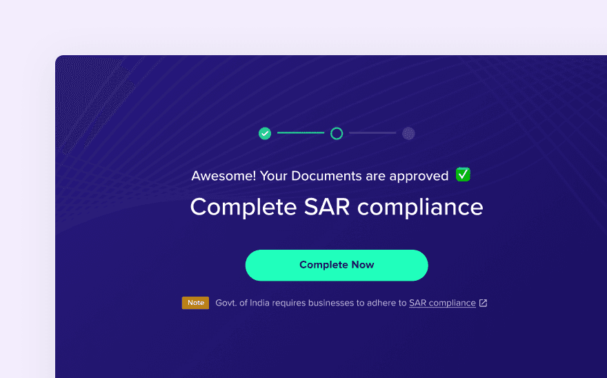
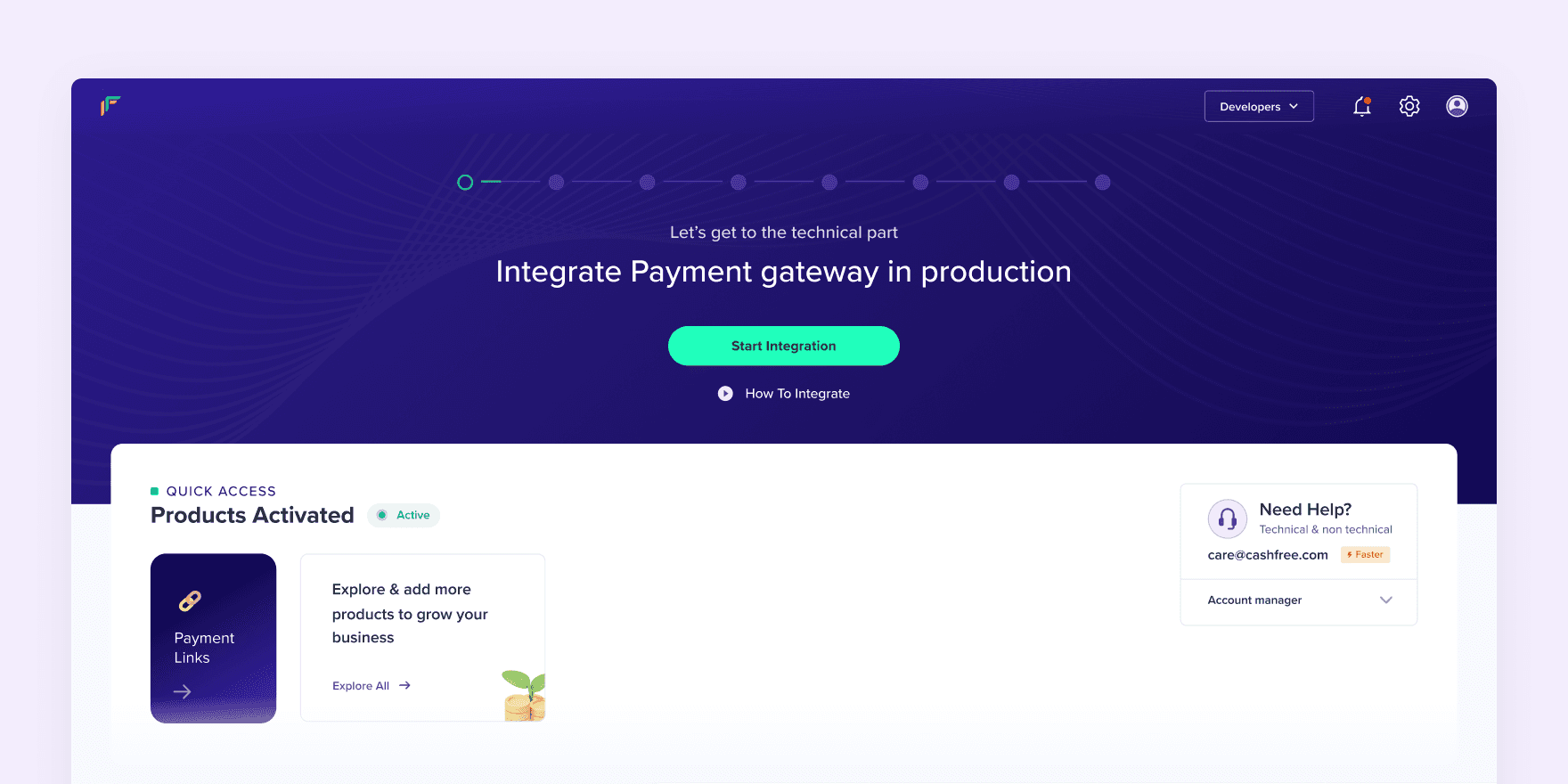
Improving visibility of onboarding status
Implement a detailed progress tracker that provided Better system visibility and updates statuses. throughout the journey along with provision to correct & complete without support intervention.
🔴
Earlier
🔴
Earlier
✅
New
✅
New

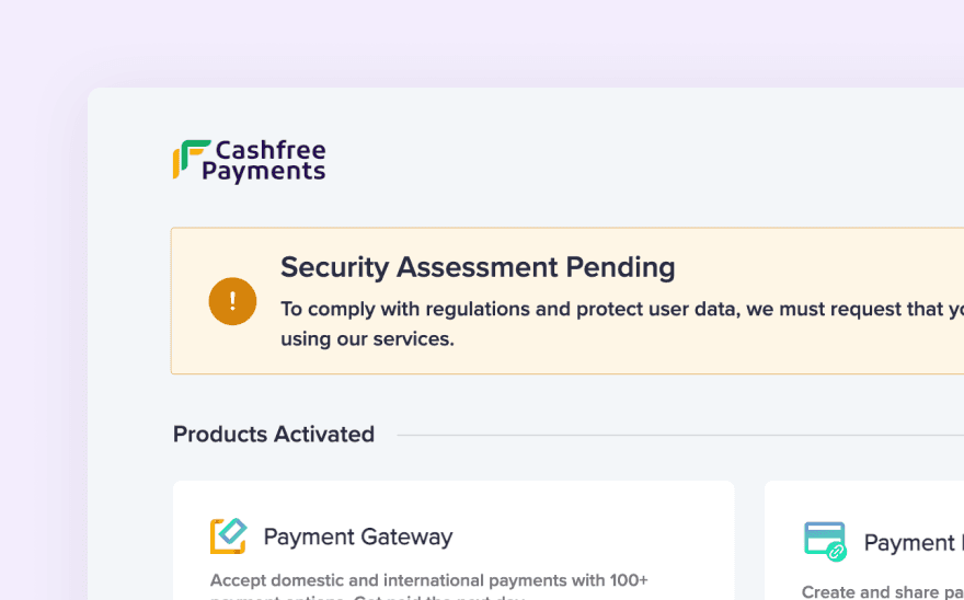
The top section of the page is dedicated to keep the users infromed about what stage they are in
The top section of the page is dedicated to keep the users infromed about what stage they are in
SOLUTION: ISSUE 02
09
SOLUTION: ISSUE 02
09
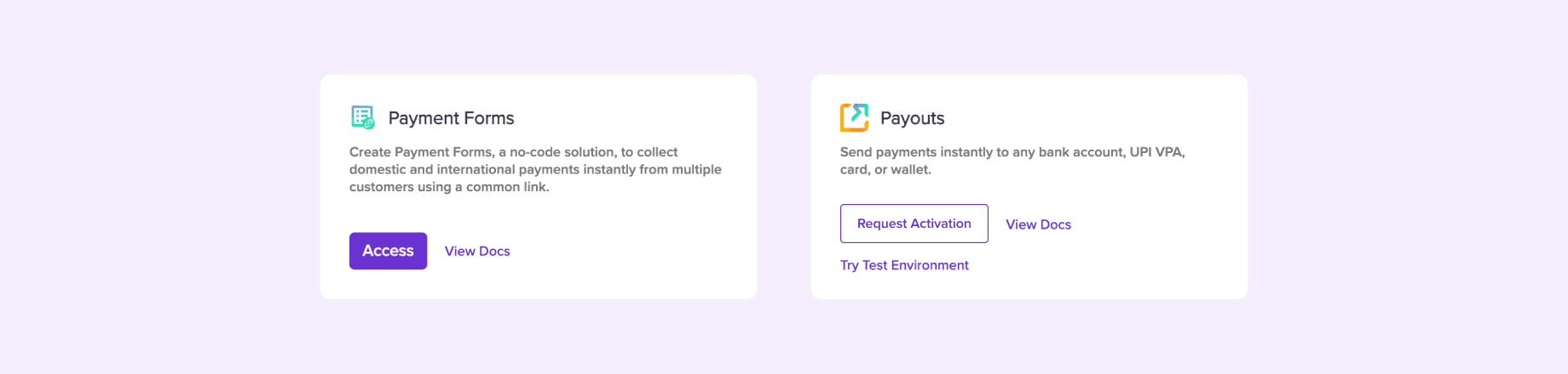
Making API keys easily discoverable
Improved the information hierarchy to simplify the process of finding API keys, differentiate between test and production API keys visually and contextually.

Previous flow to find API keys
Previous flow to find API keys

API keys clearly expsoed upfront
API keys clearly expsoed upfront
SOLUTION: ISSUE 03
10
SOLUTION: ISSUE 03
10
Introducing integration helper guide checklist
Provided visibility on integration journey & statuses. and comprehensive dynamic helper guide that helps easily navigate the integration process step by step without external help.
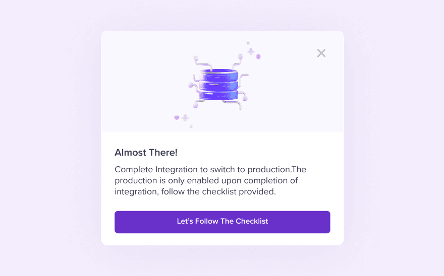
Popup nudges to start integration
Popup nudges to start integration
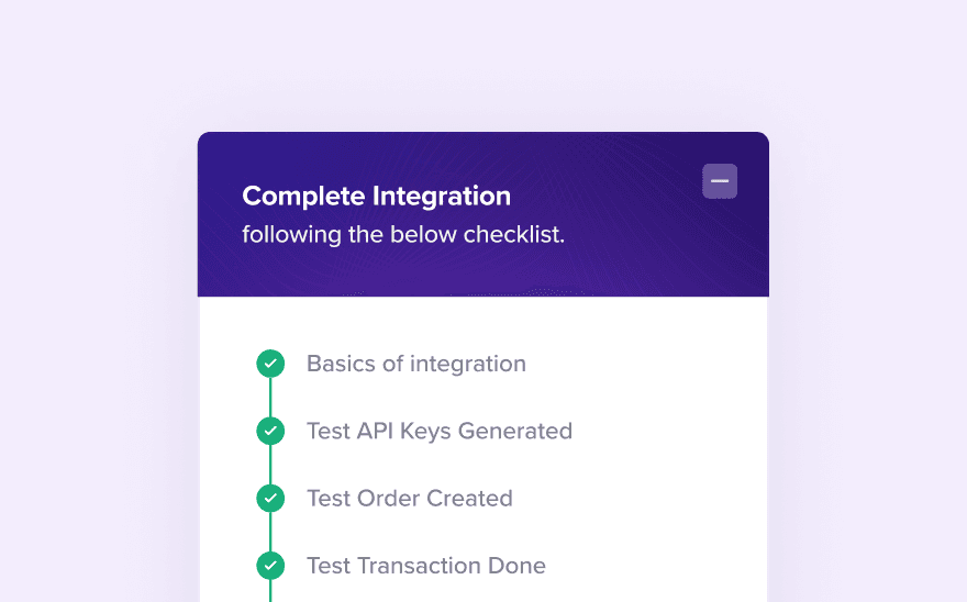
Integation checklist guide
Integation checklist guide
As soon as onboarding is done the same framework nudges to do integration & projects its progress
As soon as onboarding is done the same framework nudges to do integration & projects its progress
SOLUTION: ISSUE 04
11
SOLUTION: ISSUE 04
11
Amending production/test environment interaction
We amended the interaction for switching between test and production environments, replacing the confusing button with a more familiar interaction pattern. This change also helped differentiate test and production API keys, addressing a previous integration issue. Additionally, The new design is more compact and less prominent, reflecting feedback that it’s infrequently used.

Swicther to change between test/prod mode placed less obstructively sticky at top
Swicther to change between test/prod mode placed less obstructively sticky at top
SOLUTION: ISSUE 05
12
SOLUTION: ISSUE 05
12
Easily distinguishable
product cards
Brought Improved visual differentiation on different types of product cards by incorporating distinct visual elements such as different background colors, icons, and labels.
An actiavted and non activated product card that looks very similar previously
An actiavted and non activated product card that looks very similar previously

The new activated product card visuallu distinct from non activte ones.
The new activated product card visuallu distinct from non activte ones.
Non activated product card hover interaction
Non activated product card hover interaction


A few other concepts created in the process of solutioning
SOLUTION: ISSUE 06
13
SOLUTION: ISSUE 06
13
Enabling quick activation of no KYC products
Adding prominent labels and visual cues to help merchants quickly understand that additional KYC is not required, encouraging them to activate other products without hesitation.

The new product card for non kyc actiavtion was clearly communicated with visual labels and UX copy.
The new product card for non kyc actiavtion was clearly communicated with visual labels and UX copy.
SOLUTION: ISSUE 07
14
SOLUTION: ISSUE 07
14
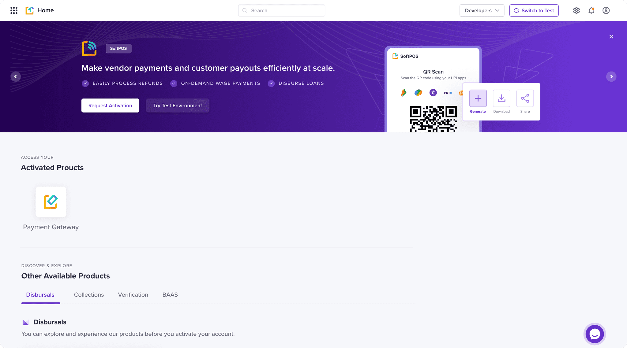
Facilitating promotional space
Added a dedicated space on the landing page for displaying periodically rotating banners highlighting key product offerings and new feature updates. This keeps users informed and captures potential leads effectively.

Introduced new set of recommended product cards based on user business to cross-sell viable products
Introduced new set of recommended product cards based on user business to cross-sell viable products

A dynamic space was made at top area to accomadate promotional banners and communicate feature updates
A dynamic space was made at top area to accomadate promotional banners and communicate feature updates
SOLUTION: ISSUE 08
15
SOLUTION: ISSUE 08
15
Bringing contextual product learning ability
We enhanced each product card with a more detailed explanation when users look to learn more, repurposed from website marketing materials. These carousel screens visually explain the product's functionality and business benefits clearly, facilitating seamless product exploration without leaving the landing page. Ensuring they can easily grasp the value of each offering
A few sections from cashgram UI
A few sections from cashgram UI
FINAL INTERACTION
02
FINAL INTERACTION
02

FINAL OUTCOME
16
FINAL OUTCOME
16
Tracking success
metrics on changes
Improving metrics like product activation % after sign-up, integration customer tickets & reducing the lead time of product activation was aimed and achieved. All measures are averaged over 3 months.
78%
🎉 Product activation happened after sign-up which was at 57%.
53%
Reduced integration-related customer tickets which were around 112 monthly average to 59 tickets, .
Customer tickets each month are around integration queries.
26 days
Reduced high average TAT to around 41 days which was at an average of 67 days from Signup to activate one product.

💰
Cashgram
Cashfree Payments
Thanks for visiting my portfolio, Lets build together!
On Light

Thanks for
visiting my portfolio,
Lets build together!
Thanks for
visiting my portfolio,
Lets build together!
Thanks for visiting my portfolio,
Lets build together!